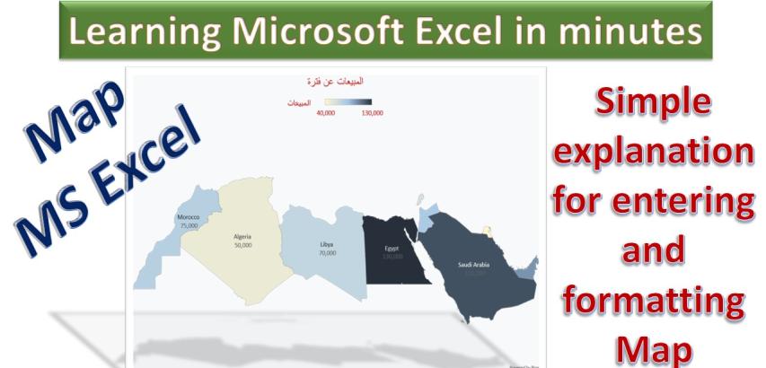
Inserting and formatting a map in Microsoft Excel can be a powerful way to visualize geographical data and gain insights from your information. Whether you are working with sales figures by region, demographic data by location, or any other dataset with a spatial component, Excel provides the tools to create dynamic and informative maps.
In this guide, we will explore the step-by-step process of inserting a map into your Excel worksheet and then delve into the details of how to format and customize that map to best suit your needs. You will learn how to present your data effectively, emphasize key information, and make your map visually appealing.
To insert and format a map in Microsoft Excel, follow these step-by-step instructions:
Inserting a Map:
Open Excel: Start by opening Microsoft Excel and creating a new or opening an existing workbook where you want to insert the map.
Data Preparation: Ensure that your data is well-structured with a location-based dataset. For example, you may have a list of countries, regions, or cities and corresponding data values.
Select Data: Click on a cell within your data set or select the entire dataset. This step is crucial as Excel will use this data to plot the map.
Insert Map: Go to the "Insert" tab in the Excel ribbon.
Choose "Map": Under the "Insert" tab, you'll find the "Map" option. Click on it.
Select "Map Chart": A dropdown menu will appear, showing "Map Chart" as one of the options. Click on it.
Map Creation: Excel will automatically generate a map using your data. The map will include the geographical regions you selected and display the corresponding data on it.
Formatting the Map:
Select the Map: Click on the map to select it. You'll notice "Chart Elements" and "Chart Styles" icons on the top right corner of the map.
Chart Elements: Clicking on "Chart Elements" allows you to customize various elements of the map, including title, data labels, legend, and more. You can choose which elements to display or hide.
Chart Styles: Click on "Chart Styles" to change the appearance of your map. Excel provides several pre-defined styles that you can choose from to change the color scheme and overall design.
Map Title: If you want to add a title to your map, click on "Chart Elements" and then "Chart Title." You can enter your desired title, and it will be added to the map.
Data Labels: To display data values on the map, click on "Chart Elements" and then select "Data Labels." This will add values to the regions on the map.
Color Customization: You can change the colors used on the map by selecting a region and then choosing "Format" from the Excel ribbon. Here, you can change the fill color and border color for specific map elements.
Legend: To show a legend for the map, click on "Chart Elements" and then select "Legend." The legend will provide context for the data represented on the map.
Chart Area: Click on the map area itself and choose "Format" to access further formatting options. You can adjust fill, border, and shadow effects for the map.
Data Filtering: You can filter the data displayed on the map. Click on a region, and then use the "Filter" option to choose what specific data you want to show or hide.
Save and Share: Once you've inserted and formatted your map, save your Excel file. You can also copy the map and paste it into other documents or presentations.
By following these steps, you can easily insert and format a map in Microsoft Excel to visualize your data geographically and make it more understandable and appealing.
