Cascading Style Sheets, commonly known as CSS, is a stylesheet language used to describe the presentation and formatting of a document written in HTML (Hypertext Markup Language) or XML (Extensible Markup Language).
It controls the layout, colors, fonts, spacing, and overall visual appearance of web pages, effectively separating the content (which is handled by HTML) from the design. This separation makes websites easier to maintain, more accessible to screen readers, and responsive across various devices such as desktop computers, tablets, and mobile phones.
Why Learn CSS?
Learning CSS is essential for anyone interested in web development, design, or even basic customization of websites—for example, on platforms like WordPress or personal blogs. It empowers you to create visually appealing, user-friendly interfaces without relying on complex computer programming.
CSS has evolved significantly over time. Modern features include Flexbox, Grid, animations, and media queries, which enable the creation of sophisticated and dynamic designs.
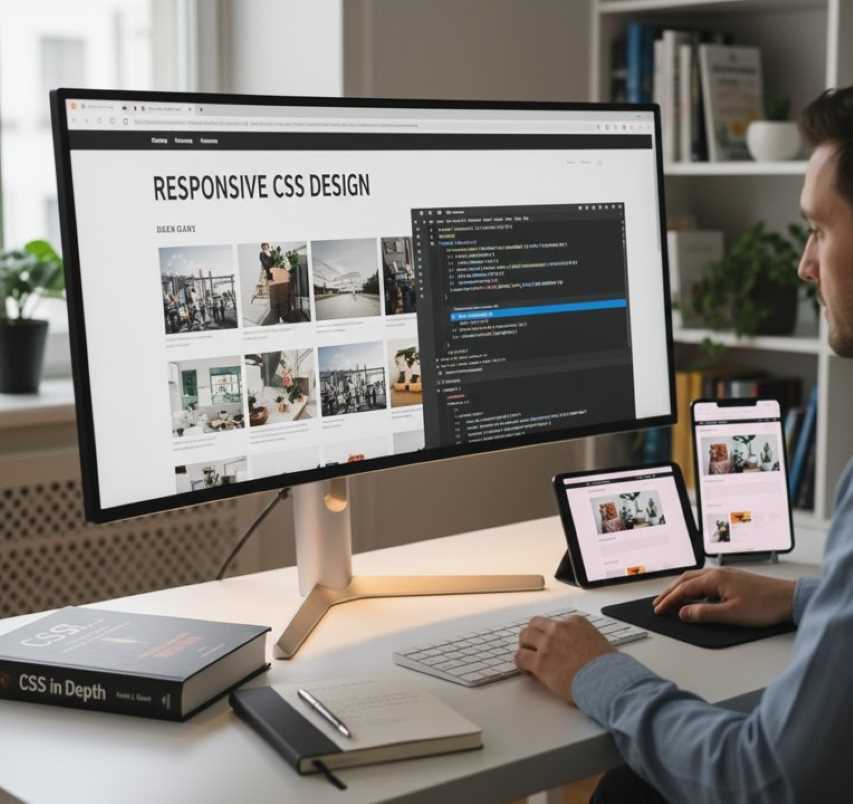
How to Learn Effectively
Start with the basics: Understand how CSS interacts with HTML elements.
Practice hands-on: Use tools like CodePen, JSFiddle, or a local code editor (such as Visual Studio Code) combined with a web browser's developer tools (accessed via F12 or Right-Click > Inspect).
Build progressively: Begin with simple text styling, then move to page layouts, responsiveness, and advanced visual effects.
Utilize Resources: Excellent free resources include MDN Web Docs, freeCodeCamp, and W3Schools. Books such as "CSS in Depth" by Keith J. Grant are also valuable. Aim for one to two hours of daily practice.
1. Basic Syntax and Selectors
CSS rules consist of a selector (which targets specific HTML elements) followed by a declaration block enclosed in curly braces {}. Each declaration contains a property (for example, color) and a value (for example, red).
Types of Selectors:
Element types: Targets tags like p for paragraphs.
Classes: Targets elements with a specific class attribute, written as .class-name.
Identifiers (IDs): Targets a unique element, written as #id-name.
Pseudo-classes: Targets a specific state, such as :hover for mouse-over effects.
The "Cascade": CSS "cascades," meaning styles can be inherited from parent elements. Specificity rules determine which style is applied if there are conflicts; for example, an ID selector will override a Class selector.
Example Code
HTML (save as index.html):
HTML
<!DOCTYPE html>
<html>
<head>
<link rel="stylesheet" href="styles.css">
</head>
<body>
<h1>Hello, World!</h1>
<p class="intro">This is a paragraph.</p>
<p id="special">This is special text.</p>
</body>
</html>
CSS (save as styles.css):
CSS
/* Element selector */
h1 {
color: blue; /* Property: value */
font-size: 24px;
}
/* Class selector */
.intro {
background-color: lightgray;
padding: 10px;
}
/* ID selector */
#special {
font-style: italic;
color: green;
}
Expected Result
When you open index.html in a browser:
The <h1> heading will appear blue and 24 pixels in size.
The first paragraph (class "intro") will have a light gray background with 10 pixels of padding around the text.
The second paragraph (ID "special") will appear italicized and green.
2. Colors, Fonts, and Text Styling
CSS manages visual text properties which are foundational for readability and branding.
Color: Defined using names, Hexadecimal codes (like #FF0000 for red), RGB (Red Green Blue), or HSL (Hue Saturation Lightness).
Typography: Controlled by font-family (for example, 'Arial'), font-size (using pixels, ems, or rems), text-align, and line-height.
Example Code
HTML
<p class="styled-text">Learning CSS is fun!</p>
CSS
.styled-text {
color: #333333; /* Dark gray */
font-family: 'Helvetica', sans-serif;
font-size: 18px;
text-align: center;
line-height: 1.5;
text-decoration: underline;
}
Expected Result
The paragraph text will appear centered, displayed in a clean Helvetica font (or a generic sans-serif if Helvetica is unavailable), sized at 18 pixels, with 1.5 times the normal line spacing, underlined, and colored dark gray.
3. Box Model and Spacing
Every HTML element is essentially a rectangular "box." Understanding this concept is critical for preventing layout issues.
The Box Components:
Content: The actual text or image.
Padding: The space between the content and the border (inner space).
Border: The line surrounding the padding.
Margin: The space outside the border, separating the element from neighbors (outer space).
Example Code
HTML
<div class="box">This is a box.</div>
CSS
.box {
width: 200px;
height: 100px;
padding: 20px;
margin: 10px auto; /* Auto centers horizontally */
border: 2px dashed red;
background-color: yellow;
box-sizing: border-box; /* Includes padding in width/height calculations */
}
Expected Result
A yellow rectangular box, 200 pixels wide and 100 pixels tall (including padding), centered on the page. It will have a 10-pixel outer margin, a dashed red border, and 20 pixels of inner padding around the text.
4. Layouts with Flexbox
Flexbox is a one-dimensional layout model designed for aligning items in rows or columns. It is excellent for responsive designs.
Key Properties:
display: flex;: Activates Flexbox on the container.
flex-direction: Defines the direction (row or column).
justify-content: Defines horizontal alignment (main axis).
align-items: Defines vertical alignment (cross axis).
Example Code
HTML
<div class="container">
<div class="item">Item 1</div>
<div class="item">Item 2</div>
<div class="item">Item 3</div>
</div>
CSS
.container {
display: flex;
flex-direction: row; /* Items in a row */
justify-content: space-between; /* Space between items */
align-items: center;
height: 200px;
background-color: lightblue;
}
.item {
background-color: white;
padding: 10px;
border: 1px solid black;
}
Expected Result
A light blue container featuring three white items positioned side-by-side. They will be evenly spaced horizontally and centered vertically. If the browser window is resized, the items will maintain their alignment.
5. Responsive Design with Media Queries
Media queries allow websites to be "mobile-friendly" by applying different styles based on screen size or orientation. This is achieved using the @media rule to target specific "breakpoints" (for example, widths smaller than 600 pixels).
Example Code
(Add this to the CSS from the Box Model example above)
CSS
@media (max-width: 600px) {
.box {
width: 100%; /* Full width on small screens */
background-color: pink; /* Change color */
}
}
Expected Result
On screens wider than 600 pixels, the box remains 200 pixels wide and yellow. On narrower screens (such as mobile phones), the box expands to fill 100% of the width and changes color to pink.
6. Animations and Transitions
You can add interactivity using transition (for smooth changes over time) or @keyframes for complex animations.
Example Code
HTML
<button class="btn">Hover Me</button>
CSS
.btn {
background-color: blue;
color: white;
padding: 10px;
transition: background-color 0.3s ease, transform 0.3s ease;
}
.btn:hover {
background-color: green;
transform: scale(1.1); /* Enlarge slightly */
}
Expected Result
A blue button that, when hovered over with a mouse, smoothly changes color to green and scales up by 10% over a duration of 0.3 seconds.
Advanced Topics and Tips
Grid Layout: Use display: grid; for two-dimensional layouts involving both rows and columns.
Variables: Use custom properties like --main-color: blue; to store reusable values.
Preprocessing: Tools like Sass or Less extend CSS capabilities with variables, nesting, and mixins for larger projects.
Best Practices: Keep your CSS organized (for example, use BEM—Block Element Modifier—naming for classes), minimize specificity wars, and test compatibility across different browsers.
Common Pitfalls: Forgetting units (such as pixels), ignoring accessibility (such as poor color contrast), or overusing the !important flag to force styles.
Path to Mastery
Practice by building real projects: create a personal portfolio, a responsive landing page, or clone simple websites. Track your progress with challenges on websites like CSS Battles or Frontend Mentor. With consistent effort, you can master CSS in one to three months.
 |  |  |
 |  |  |